
How to Choose Visual Content for Projection Mapping?
How do you make content work on a large façade? A guide to narrative, shape, contrast, movement and testing before production.
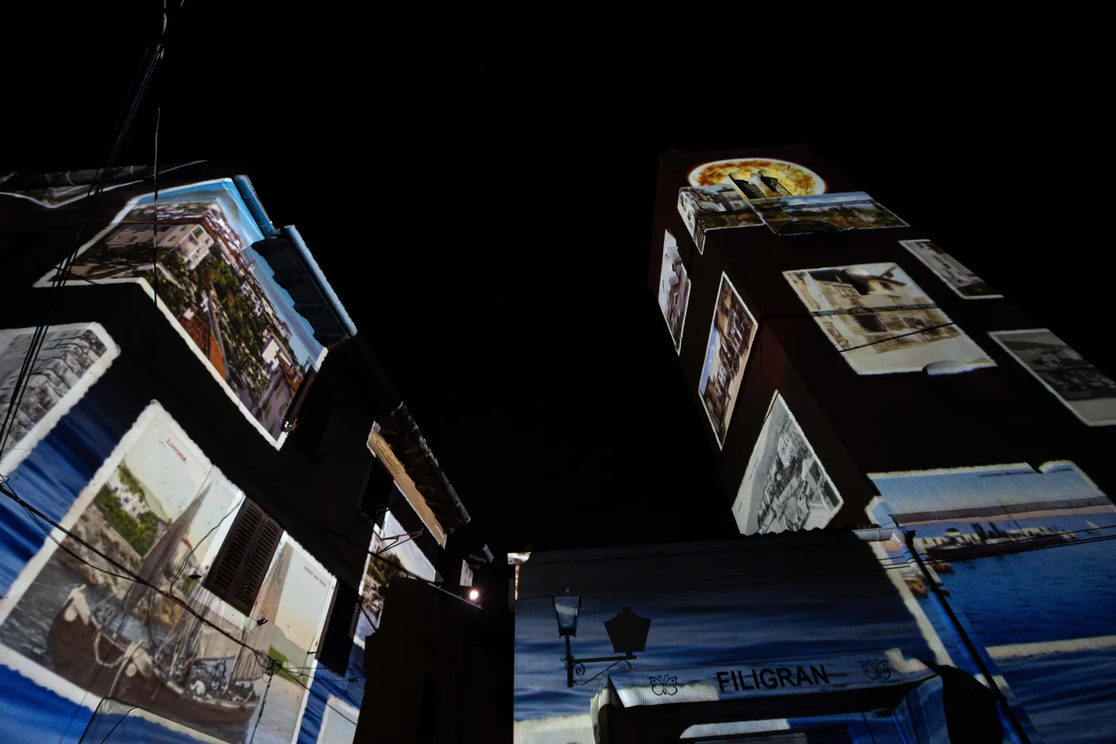
Start with an idea, not an animation
Projection mapping content begins with what a visitor should feel, not with which effect looks the most impressive. The idea should be clear enough to be translated into movement, rhythm, space and sound.
A short treatment is a useful team tool: one sentence, three visual rules and one emotional objective can prevent a pile of unrelated effects.
Shape before decoration
Content for projection needs its own geometric logic. Lines, grids, rhythms, contours or fields can form the visual language. Decoration comes after the underlying shape is readable.
If the content relies on photography or a complex visual, test how it behaves on a large surface, with low contrast and from different angles.
Contrast is the grammar of projection
Light, shadow, black and white create hierarchy. If everything glows equally, the viewer does not know where to begin. If contrast is too harsh, the façade loses its material and depth.
Design the layers clearly, but leave room for the architecture. Empty space, a quiet façade and a moment without projection can be as important as a large visual moment.
Test before the big render
Make a short animation test, then watch it from different distances and in different ambient light. Check movement speed, detail legibility, contrast and transitions.
The best content is not always the richest. Sometimes one precise movement that fits the architecture is enough.